Skin+Me
Problem:
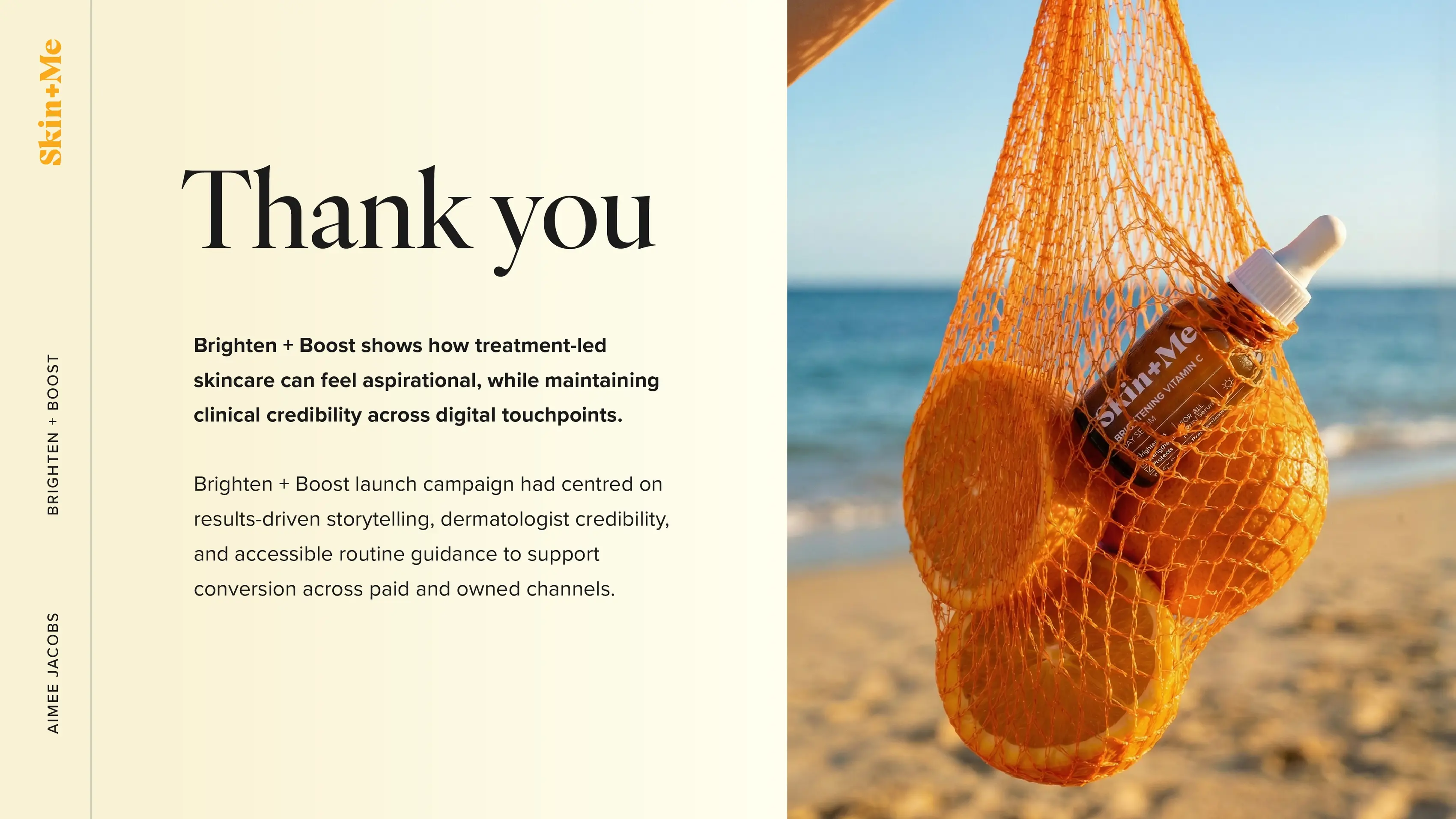
Skin + Me were launching their new Brighten + Boost Vitamin C range and needed a cohesive creative direction across email, paid social, and organic channels.
Solution:
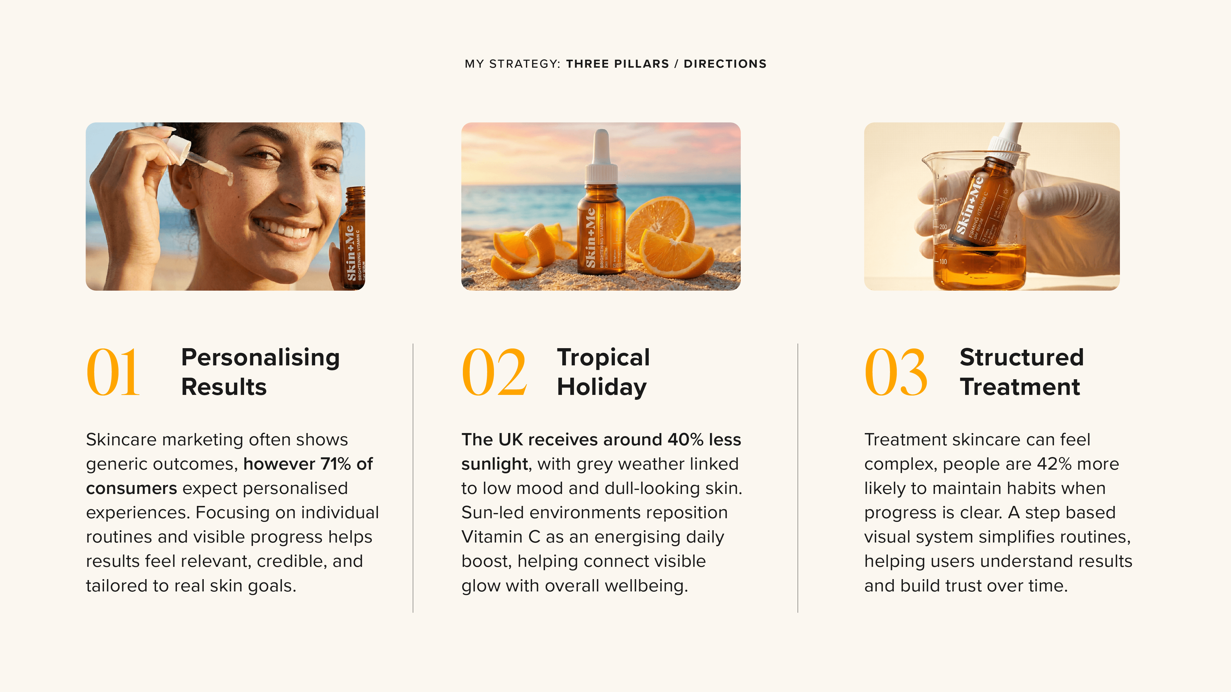
To address this, I explored three strategic routes that balanced education with emotion:
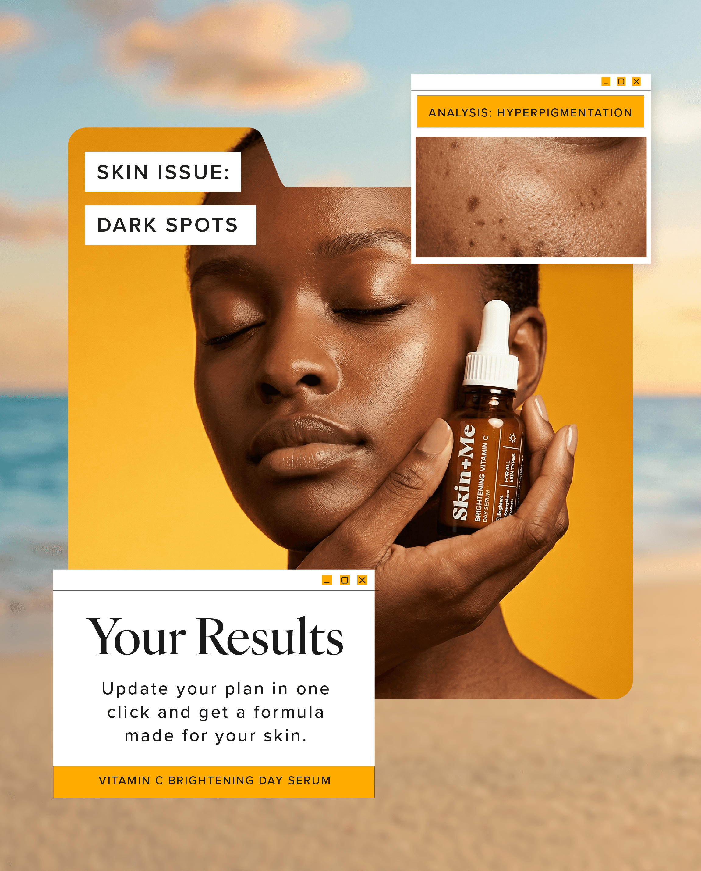
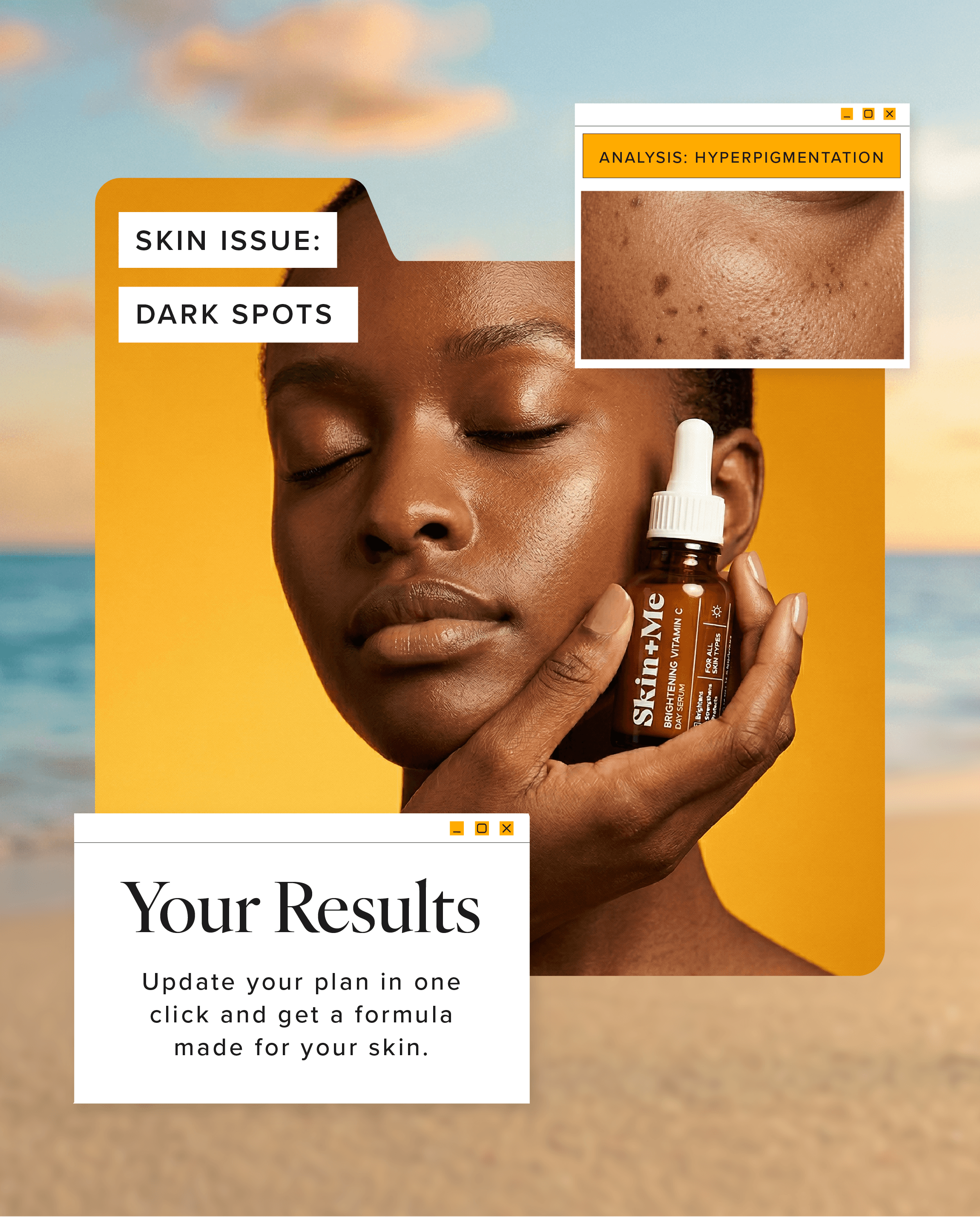
Personalisation: highlighting Skin + Me’s individual skin goals.
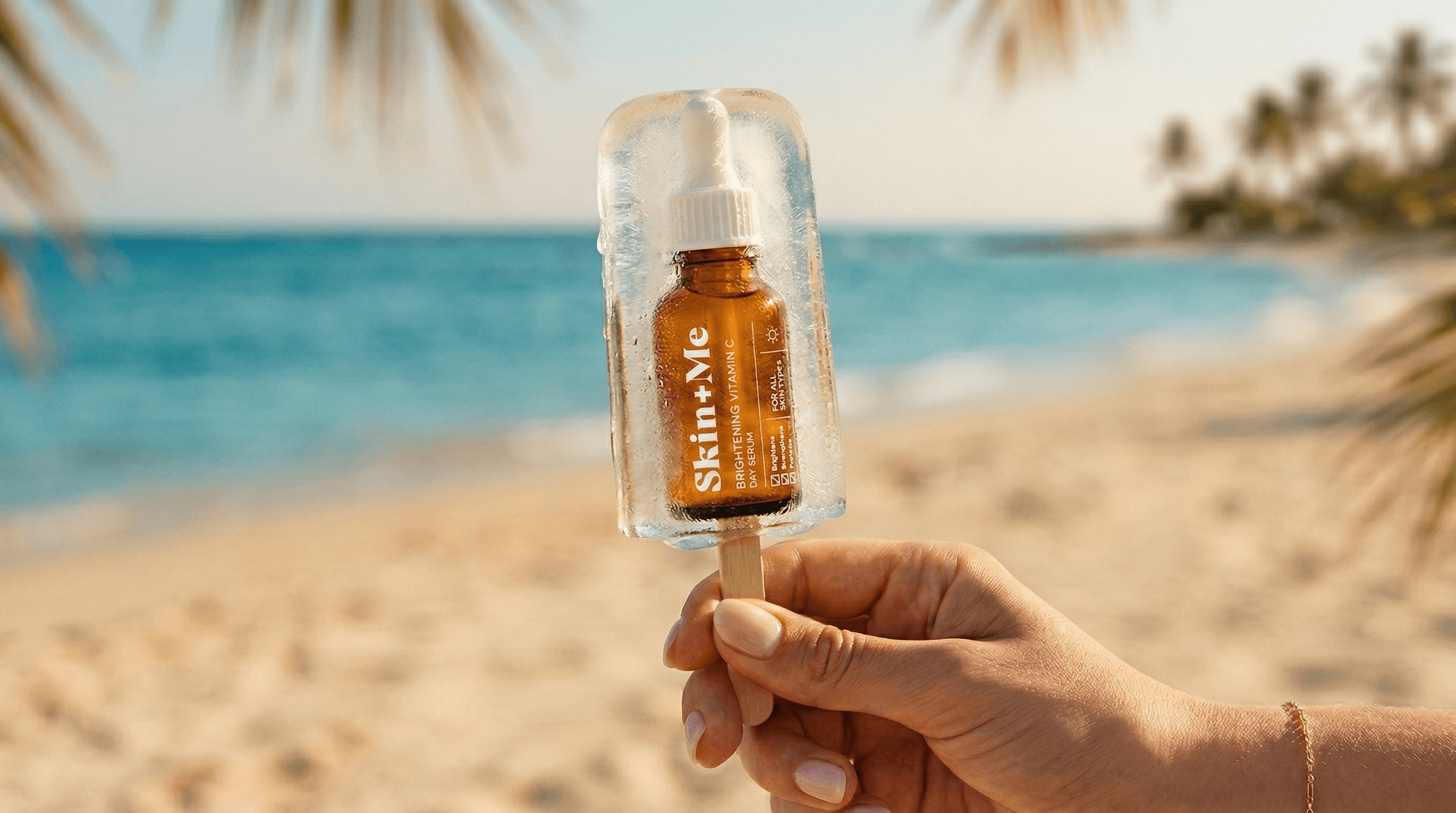
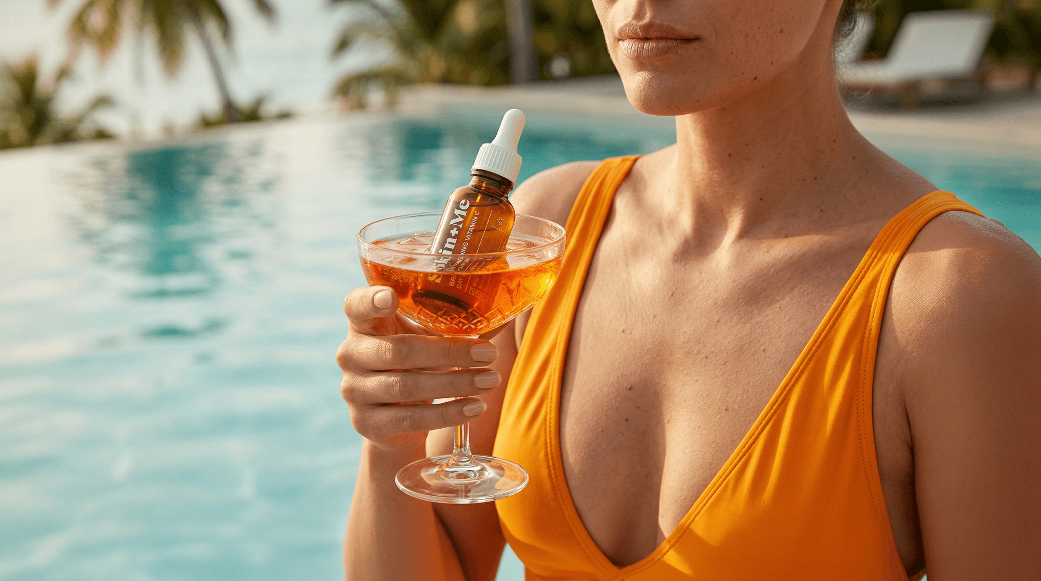
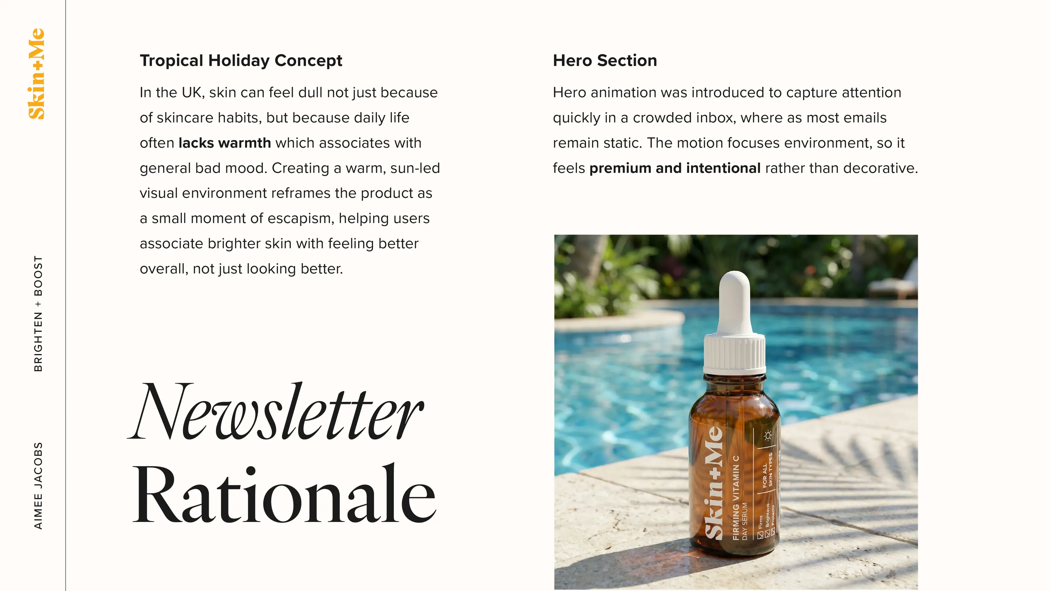
Tropical Holiday: using sunlight as a visual metaphor for glow.
Structured Treatment Plan: simplifying routines into clear, step-based progress to support understanding and conversion.
My involvement
Led the project end-to-end, from strategy and concept through to design and delivery. Brand identity and product packaging were pre-existing assets provided by Skin + Me.
Deliverables
Type
Client Work

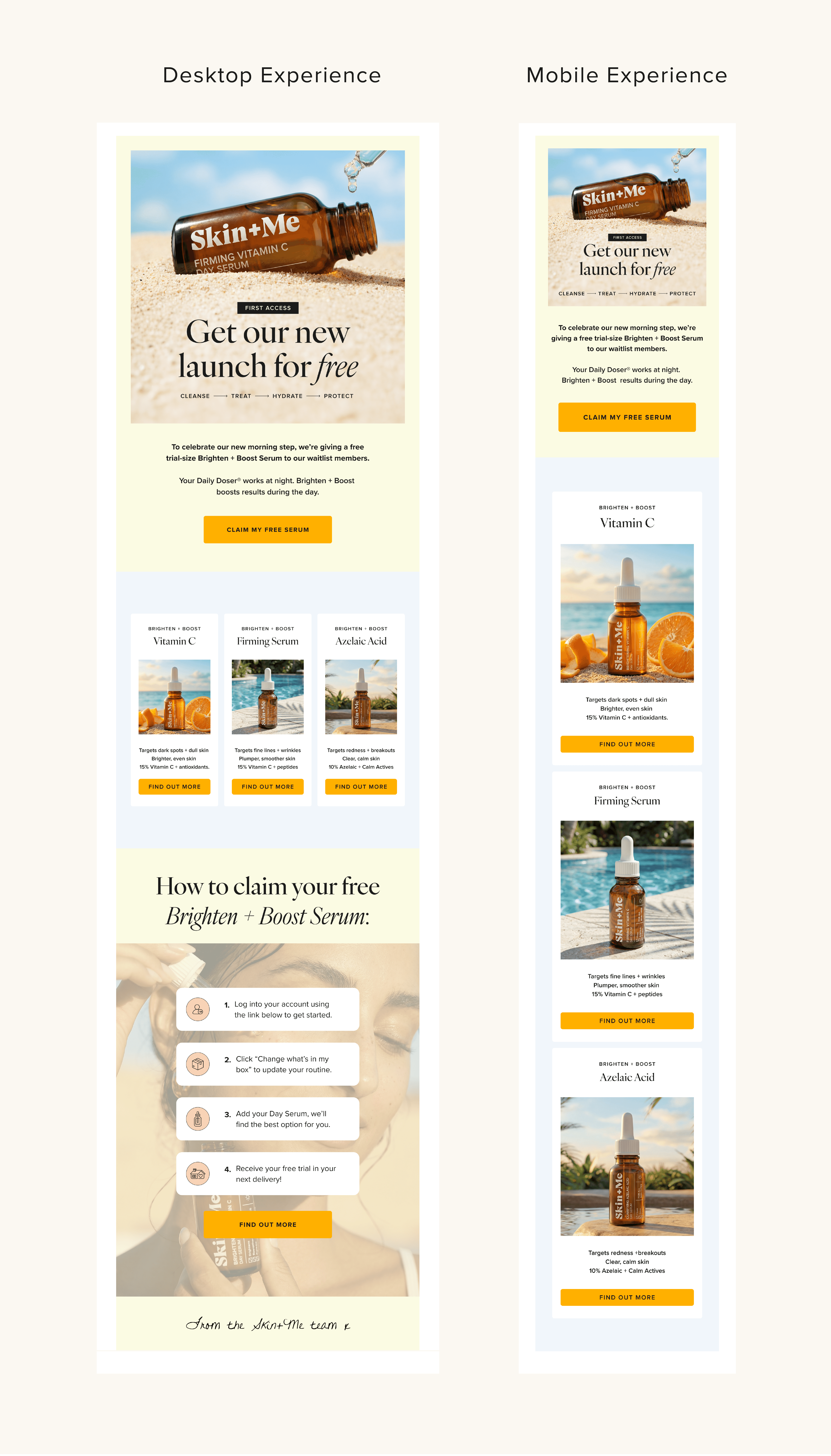
Email Newsletter
The layout was simplified so the launch and offer are clear at a glance, with defined product sections and strong CTA moments. Subtle hero motion draws attention to the serum texture, helping the email feel more premium and noticeable in a crowded inbox.
Both desktop and mobile views were designed to show how the experience adapts across devices, since most users open emails on their phones. This maintains hierarchy, readability, and consistent interaction points.
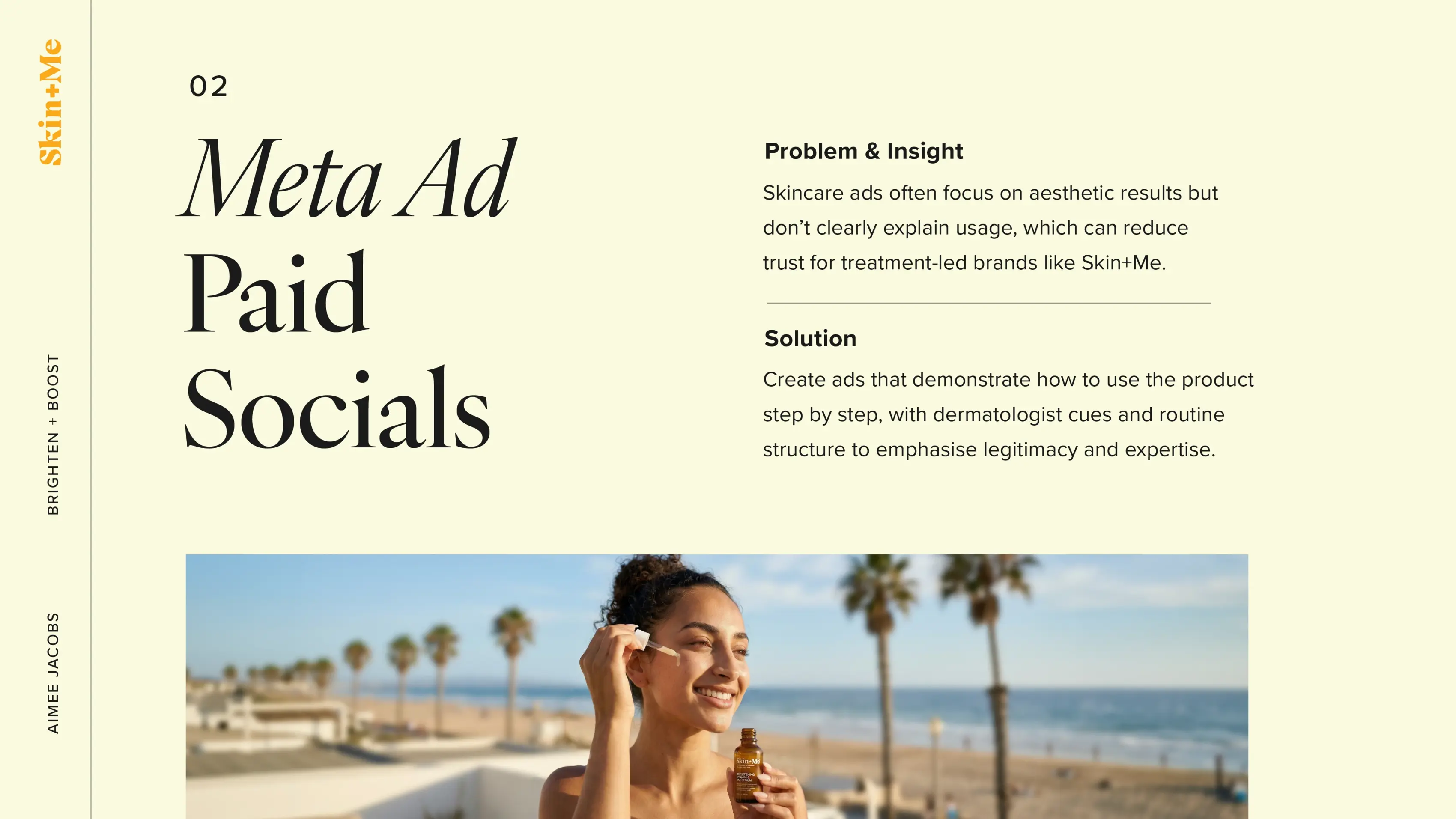
Meta Ads
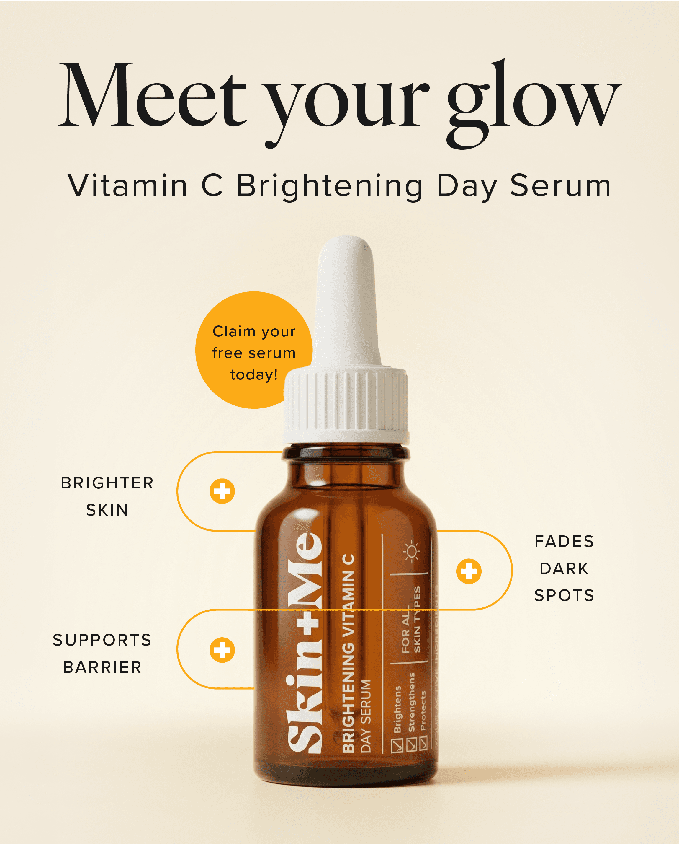


Social Media Ads
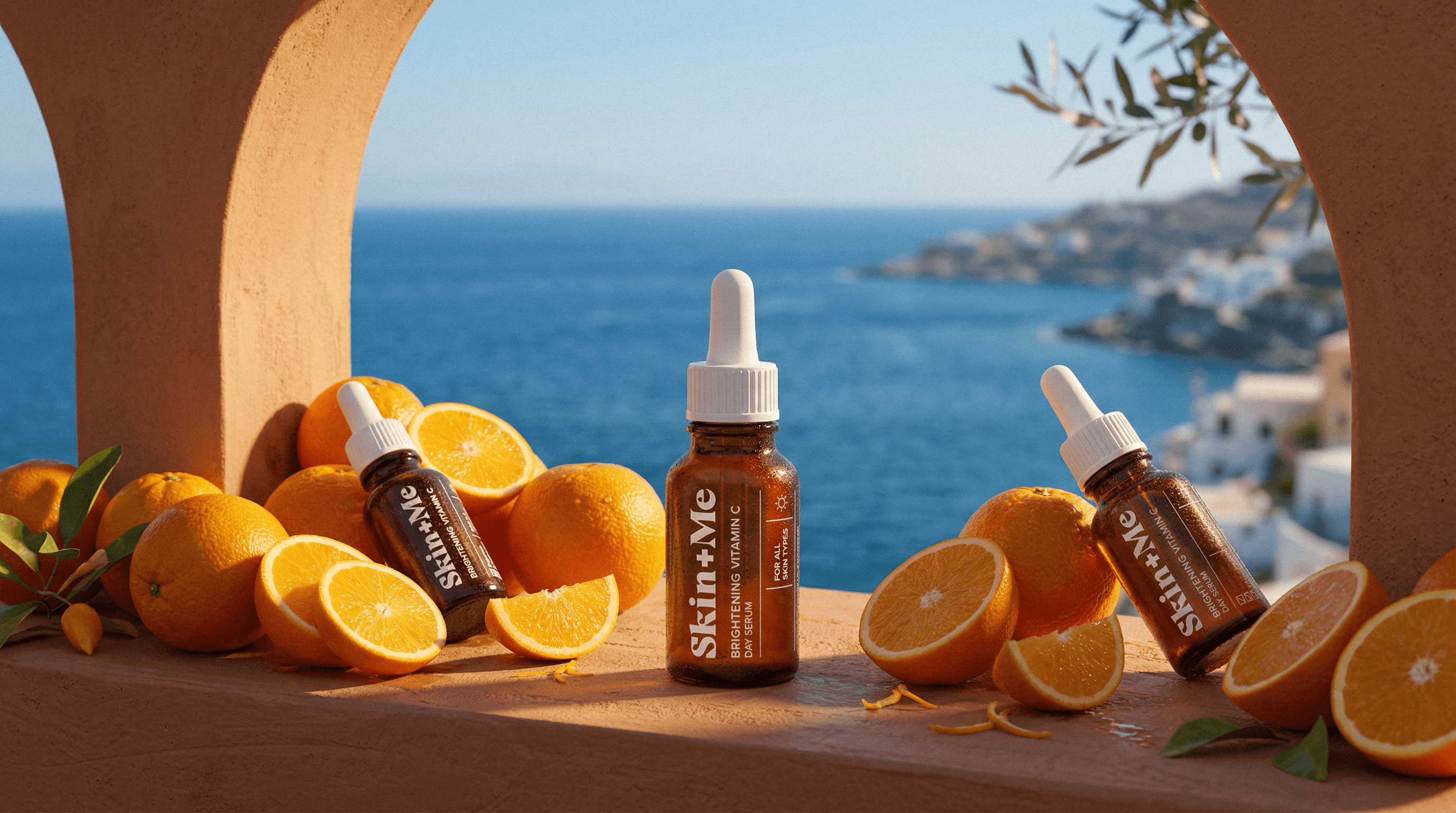
Explored Art Direction & Imagery
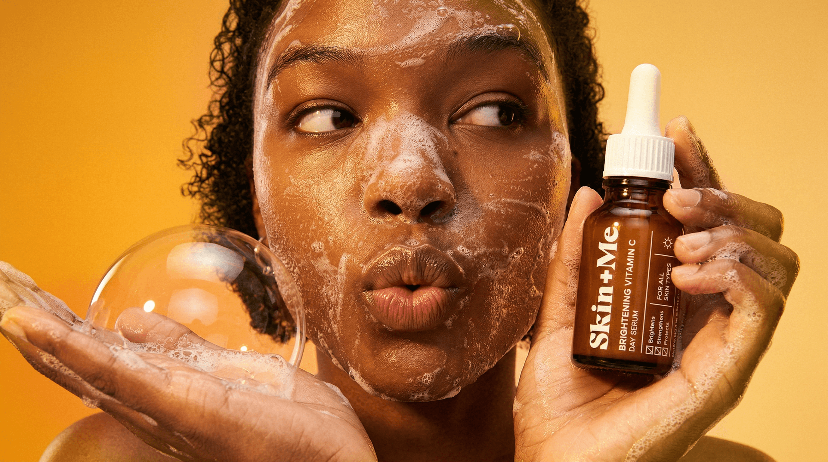
The art direction was developed to visually support the three strategic pillars, balancing clinical credibility with emotional engagement. Tropical environments link directly to the Vitamin C positioning, using sunlight as a metaphor for glow and energy, while lifestyle moments show how the product fits naturally into daily routines rather than feeling purely corrective.
Different visual routes were explored, including human-led moments, sensorial textures, and elevated product compositions, to demonstrate how the concept could scale across channels. This range supports both personalisation and structured treatment messaging, while maintaining a cohesive campaign feel.

Pitch Deck
The pitch was designed to feel as considered as the product, clean, confident, and premium. I kept the layouts consistent and structured so the story flows clearly from insight to execution, with repeated elements creating rhythm across slides.
The restrained design helps the visuals and ideas lead, while subtle clinical cues keep it aligned with Skin+Me’s treatment-led positioning. Overall, it balances aspiration with credibility so the work feels both elevated and commercially grounded.

The Process
I began by mapping ideas and quick wireframes to define the key pain points and opportunities within Skin+Me’s offer. This helped clarify how personalisation, guidance, and routine structure could translate into a clearer user journey, particularly for the newsletter, where hierarchy and flow are critical for conversion. The wireframes acted as a planning tool to prioritise content, CTA placement, and information order before moving into visual design.
The client provided limited imagery but encouraged full creative freedom using AI. I developed the majority of the campaign visuals myself, testing different tools and workflows, including Nano Banana (across multiple versions) and Kling 2.0 for motion exploration. This allowed me to transform a simple product asset into a cohesive, campaign-ready visual system aligned with the concept direction.

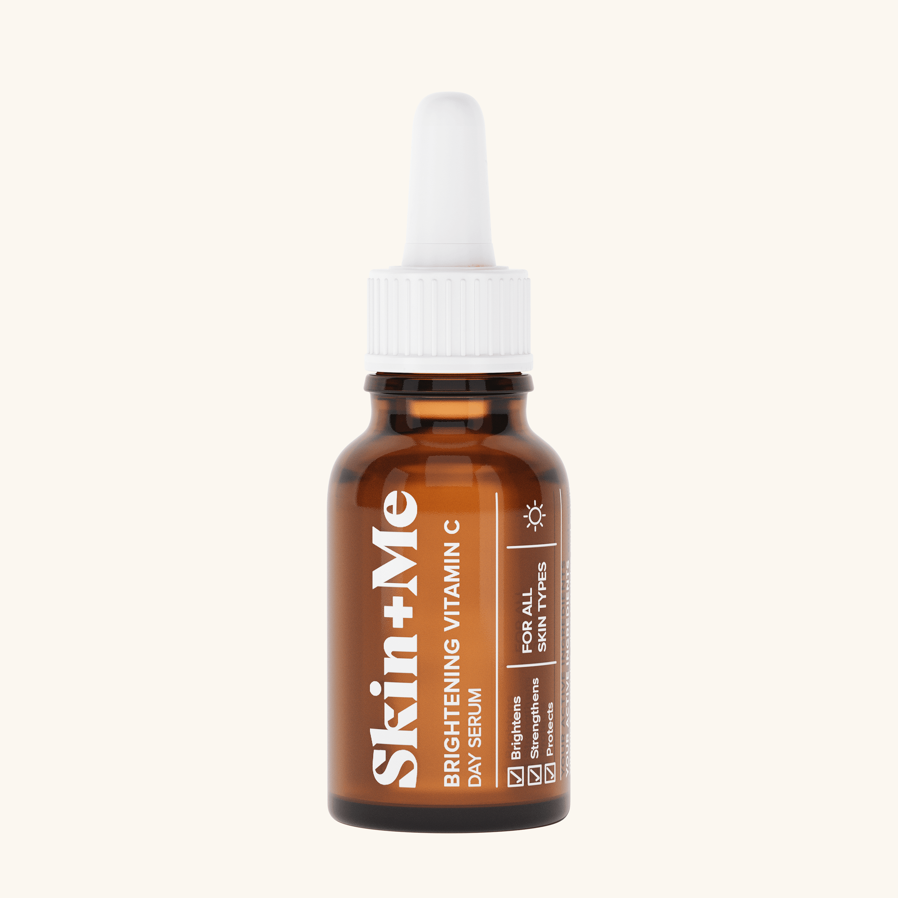
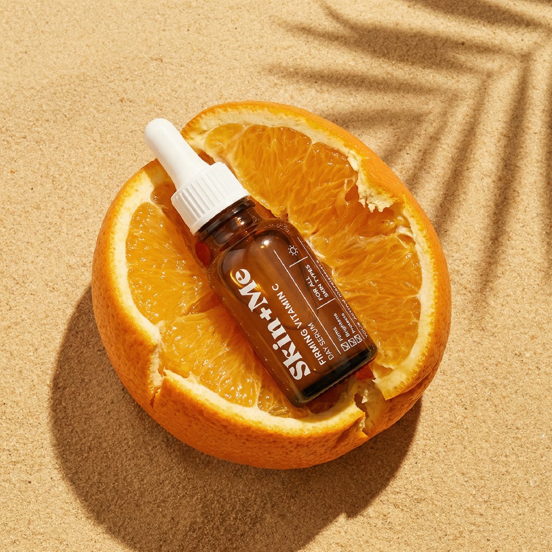
Client Provided Image